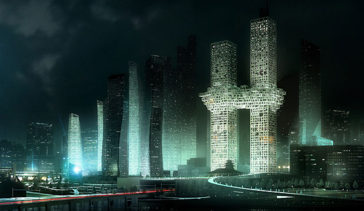
While most of the world seems to sit in economic stagnation, twiddling thumbs and sucking the ends of 2B pencils in hope of the next job, Dutch practice MVRDV have forged ahead, unleashing design philosophies and large tomes of their (mostly paper) work onto an unsuspecting public. In their latest case however, it seems to have backfired badly.

“The “Cloud” design unveiled in Seoul last week is supposed to show a cloud covering the centre of the buildings. The company said it proposed the design because it challenged the mundane shape of the typical skyscraper. A pair of luxury residential towers in Seoul would be joined in the middle by a cloud-like shape, billowing out like a tutu around two legs.”
Now, while Dutch design has lead the world for years, and the Royal Dutch Ballet in the Hague is of world class standard, it does make us wonder whether the company have really been studying the tutu, or have been having a swig from something stronger than the traditional bottle of Dutch genevers. While it is always good to see architectural firms stretching their (metaphorical) wings, there is always something more than just a little bit dodgy about efforts from MVRDV. On the one hand we have a tutu, pillowy, soft, light, and in anthropomorphic terms, clearly pelmeting the groin. Two legs below, one torso above, tutu in between: this is what a tutu looks like:

MVRDV’s design, clearly based on an explosive cloud billowing out from the twin towers, somehow made it off the dodgy-idea-pinup board, past the Design and Taste committee, and onto the front pages of the press: in the worst possible way. A word to the Dutchmen: Don’t even try to pretend that you hadn’t noticed the similarities between your design and the Manhattan project – that’s an argument you’re never going to win. Using the death of nearly 3000 people as your design genesis is never going to be a good idea.

If you want to design a cloud, there is a large worm-like structure in Auckland that bears a strong resemblance to something soft and white and fluffy.

Ask Frank Gehry if you want to know how to do stainless steel in billowing folds of fabric, and sit down for a good talk with Steven Holl if you’re keen on graphing the world into little square window openings, whether appropriate or not. But for goodness sake, don’t try the old look of astonished innocence at allegations of impropriety.
The design itself is certainly quite adventurous, appropriating design ideas from all manner of striking precedences (although the striking of Flight 901 etc should not be to the forefront), including the famous Moshe Safdie housing at Habitat 67 – tell me if you’ve seen this before:


Leave a Reply