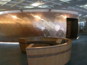
Opened this week with princely aplomb, the symbol of New Zealand’s self-sufficient justice system, ironically begins its life with Royal approval. The local architectural opinions though have not been so benevolent towards this Primo Supremo architecture … but – as I heard from one friend the other day – WaM are big enough and ugly enough to take a bit of criticism … so let’s start with the crowning glory of the building – that hulking bit of welded bronze trying hard – but not succeeding – to be a pohutakawa-ish screen
It’s raw, it’s tough, and its craft is not one of finesse and elegant – but instead finds its lineage among a pioneering toughness. There’s no pretense about the masculinity of the manufacturing process here. But sadly the underscaled glimpses of gem-like ruby-glass make this massive bit of metal look more like a Westie tiara than a integral part of the Supreme Court facade.
It sits uncomfortably where it is, and appears to want to be attached to … probably any other building.
But at least it’s trying to do something – more than can be said for the sad weatherline behind – saved only by the care taken with the modeling of those wonderfully elegant columns. These have been lovingly proportioned and crafted. You can see the maker’s hand caressing them into perfection. It’s just a shame the wall behind them is so ordinary, bland and clunky. Right – I’m not going to spend any more time thinking about it …
Inside is a mixed bag too. The clumsy composition of the perimeter offices is amateurish and undermines the potential impact of the central courtroom as a sculptural object. They litter the edge, shamelessly parading their pragmatism. Why can’t New Zealand do a building which truly relishes its symbolic value with comprehensive elegance? I guess we can thank God (or whoever was in charge) that at least it’s not as goddam awful as CCM’s Defence building.
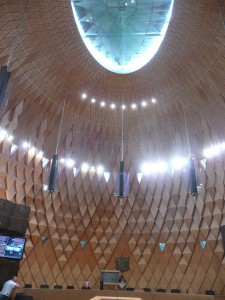
The care taken detailing the ceiling, as it is interrupted by the courtroom, makes up for some of this other mundane dreariness – but simultaneously prompts the thought about why the floor didn’t also do more work acknowledging what is the architectural climax of the building: the courtroom – where all the money and attention has been lavished – in fact it’s a bit flashy.
You can see the time and effort, the thought and the desire to impress here.
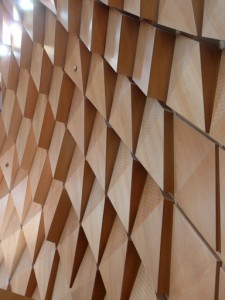
The faceted curved walls proclaim themselves as a special surface. The apex of the sphere opens up, and provides a small-scale Antipodean version of the Reichstag’s wonder.
But I guess this is the point – why do we in New Zealand public buildings always seem to stop short of architecture? Why, when we decide we might do it, do we only do it in one area of the building? and why does that one area have to seemingly rely on “look-at-me-I’m-architecture” tricks? Of course with a building as culturally, and nationally significant as a supreme court – flashy architecture is absolutely warranted. It would be mean-hearted to suggest otherwise. But … a building of this significance should be ALL good. What we got for our $80 million is unevenly executed architecture – it’s “ok” – and that’s really not good enough.
So yes – well done for some bits WaM – the courtroom itself is largely a success – but there’s another big issue at stake – and that’s how New Zealand pubic buildings can engage with architecture as a surreptitious elegance that pervades our buildings and is something that’s not only reserved for special occasions, or the showy bits of a building, but instead becomes an everyday expectation. What I’m suggesting is a better articulation of the seemingly invisible aspects of building: the designing of space, of light, and of proportions … and I think there are definitely parts of the public areas of the new Supreme Court which could have benefited from more of this kind of finish in its thinking and design.


Leave a Reply