
Drawing has been a staple of an architect’s profession for longer than architecture has been a profession …
… and given we are about to have another exhibition of architects’ (and others’) drawings with the upcoming Charity Auction to raise funds for our involvement in the Basin flyover High Court appeal, it seemed like a grand idea to recall the range of drawings that have described architecture and our built environment over the centuries. So here’s a selection from history of well-known and not so well-known images of architecture … beginning with the sixteenth-century …
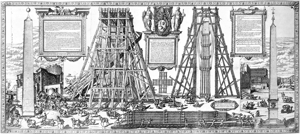
Strictly speaking an engineering drawing, Guerra and Bonifazio’s print describes the relocation of the Vatican obelisk (originally in the circus of Nero) from its location next to St Peter’s sacristy to the piazza. This was apparently an ambitious engineering project. The reason for moving the obelisk included the idea “of making the Pagan monuments serve the glory of the Catholic faith,” but was also linked to Pope Sixtus V’s vision of Rome’s new urban planning, which included locating the obelisks of Santa Maria Maggiore, the Lateran and Santa Marie del Popolo, and the restored Trajan and Antonine columns as focal points at intersections of radiating streets. This was part of a much wider programme of public works, which included draining the Pontine marshes, opening up roads, and supplying Rome with water via the Acqua Felice.

Santa Maria della Steccate is a sixteenth-century centrally-planned church, with a Greek cross plan. In the late seventeenth-century, it was decided to alter the building and extend the choir. The Oddi drawing is a half-elevation and half-section, a drawing type which assumes a symmetrical building. The drawing describes the proposed decorative work to be done prior to extending the choir.

Domenico Francia (1702-1758) was a painter and architect. This drawing shows two schemes for an illusionistic ceiling painting (quadratura) in a rectangular room. Note that this drawing is only of architectural elements as quadratura usually involved different artists for different parts of the painting with the architectural structure (niches etc.) and figures being painted by different artists.

Marc’antonio dal Re (1697-1766) was a prolific Italian engraver whose work included collections such as Le Delizia della Villa di Castellazzo (Milan, 1743). Just as Andrea Palladio’s Teatro Olimpico (1580-1585) includes trompe-l’oeil scenery by Vincenzo Scamozzi to effect illusionistic recession, Dal Re’s engraving provides a stage design which creates a greater illusion of distance than the actual depth of the stage provided.
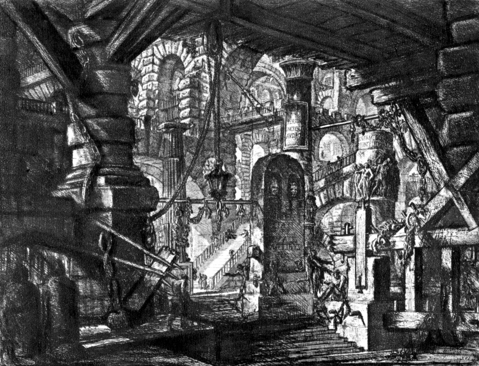
Piranesi’s famous “Carceri” or prison series are frequently seen as epitomising a high point in the history of etching, and fascinated later Romantic writers (such as Samuel Taylor Coleridge) and Edgar Allen Poe. They have been discussed as imaginary prisons, and as stage-set like, and apparently belong to a Venetian tradition of capricci, or imaginary subjects. The 1740s Carceri series was reworked ten years later.
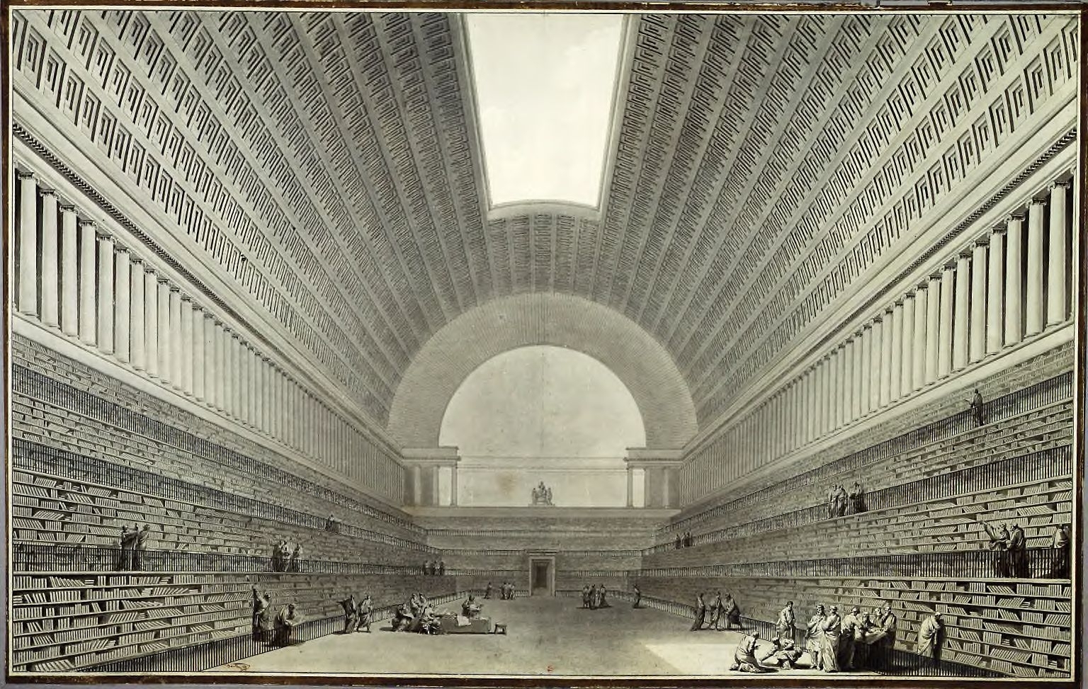
Boullee (1728-1799) was another important eighteenth-century architect, theorist and teacher. His other famous drawings include his “Cenotaphe a Newton” (1784). Many of his bold designs were restricted to pure geometric shapes such as pyramids, spheres and cylinders. He was a contemporary of Claude-Nicolas Ledoux.

Joseph Gandy (1771-1843) was John Soane’s fabulous draughtsperson, and has been described as Soane’s magician. This drawing, while awkwardly titled shows both the extent of Soane’s architectural work and Gandy’s drawing skills. We have an echo of this work in New Zealand with George O’Brien‘s equivalent painting of Robert Lawson‘s designs in Dunedin.

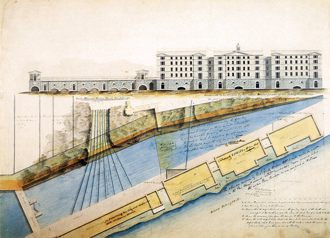
Gaff’s “Design for Factories at Fairmount” shows a design to build factories which would take advantage of the hydro-power, resulting from a steam engine and engine house recently built to raise water from the Schuylkill River to reservoirs above Fairmount. Drawing Toward Building (1986) describes Gaff’s design as “not treated as prosaically as usual for such structures generally but instead shared some of the Neoclassical features that marked the most elaborate buildings of the time.” (p. 69). The scheme was not built.

Photography is an invention of the nineteenth-century. Koppmann’s “Along the Mubren Canal” is one of numerous photographs taken by German photographers of Hamburg’s old city quarter around Wandrahmsinsel, over a period of about 15 years. This was prior to demolition making way for the new Free Harbour, and the 1883-1888 construction of the Freihafengerbiet. Architecture and its Image (p. 52) notes that “houses, breweries, and other commercial premises, public buildings, streets, canals, squares, docks, and harbourfront of old Hamburg” were photographed.

“Figure 69” is from Henry McGoodwin’s Architectural Shades and Shadows, originally published in 1904. It shows “the shades and shadows of the Corinthian order according to Vignola.” McGoodwin notes that many shadows “may be determined geometrically according to the methods previously given; but many of these shades and shadows must be drawn from imagination, or with the help of an actual model.”
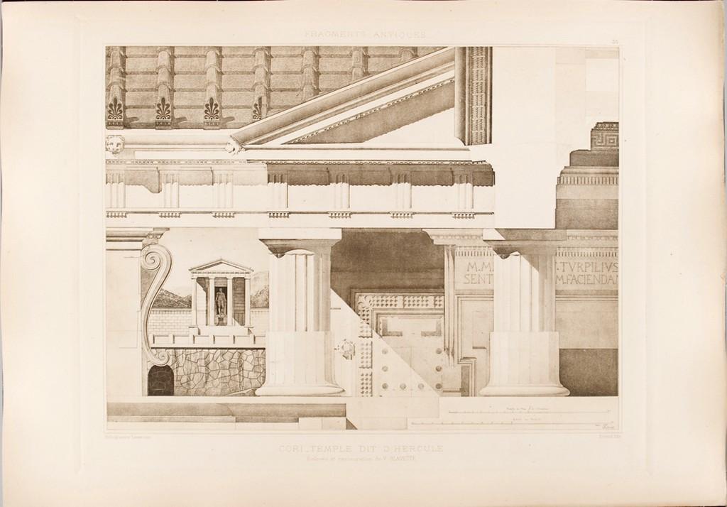
The analytique, a drawing type demonstrated in D’Espouy’s “Temple of Hercules” from his Fragments d’architecture antique d’apres les releves et resstaurations des anciens pensionnaires de l’Acadmie de France a Rome (Paris, 1950), is an artefact from the Ecole des Beaux-Arts. This was a method of teaching architecture originating in France, which was hugely influential in English and American schools of architecture. It formed the basis of formal architectural education with the establishment of the profession in the mid-nineteenth-century, and the move from the apprentice system of articling toward university-based education. Analytique drew different aspects of a building at different scales, from different viewpoints. In “Temple of Hercules” you can discern the plan, elevation and various details of the building which is drawn.
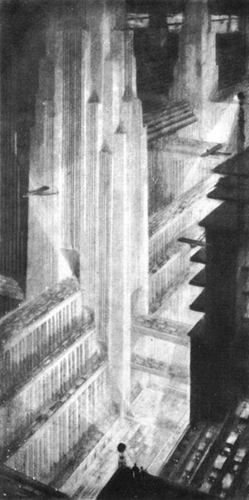
Hugh Ferriss‘ bold use of form and shade appear to have been influenced by a 1922 job resulting from New York City’s 1916 zoning laws, which limited the mass of buildings according to a formula. Ferriss was contracted to draw a series of perspectives to illustrate the architectural consequences of these planning regulations, and the drawings became the basis for his later book The Metropolis of Tomorrow (1929). Many of his rendering include buildings that are backlit with uplighting; the form of the building often cast in the darkest of shadow, strengthening the architectural profile to the point, sometimes, of a flattened two dimensionality. Night time views sometimes cause buildings to vanish indistinctive from the sky’s darkness. The persistent use of contrast is echoed in many renditions of Batman’s city of Gotham, which has clearly borrowed Ferriss’ aesthetic.

Ivan Sutherland is considered by many to have invented Computer Graphics, which is a pretty stunning thing if you think about it. Computer graphics, Computer-Aided Design (CAD), call it what you will, but it is now a fundamental part of any architectural office. Sutherland’s PhD thesis “Sketchpad: A man-machine Graphical Communications System” identified drawing as a new communication medium for computers. The related film “Thesis at M.I.T. Lincoln Labs Feb. 1963” was shown at the Spring Joint Computer Conference in 1963. Related is “Sketchpad Demo,” another film demonstration.
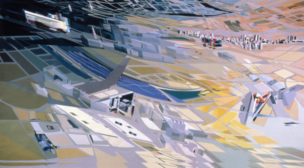
Zaha Hadid is now increasingly known for her built architecture, but in the 1980s and 1990s she was known for her innovative drawings. She is one of a number of architectural drawers associated with this period of “Paper Architecture,” including Lebbeus Woods and Daniel Libeskind. Lebbeus Woods visited Zaha’s studio in the 1980s, and has noted that “she had to originate new systems of projection in order to formulate in spatial terms her complex thoughts about architectural forms and the relationships between them.”

Brodsky and Utkin are perhaps the most renown “Paper Architects,” who worked together during the 1980s and 90s. Their work is alway manically detailed and usually intensely political, drawing apparently ridiculous propositions which astutely comment on the perversions of contemporary living and our built environment. The Tate has described their Projects portfolio (1980-1990) as drawing:
upon a variety of architectural, literary and visual sources, from classical mythology to science fiction. They depict absurd proposals and fictional cityscapes as eclectic mixes of ancient mausoleums, early industrial structures, neoclassical utopias and constructivist towers. Some of them present the modern metropolis as oppressive and alienating, reflecting the experience of living under a totalitarian regime.

Leave a Reply