On a recent visit to New York, there were many things that caught my eye, but one store in particular appeared to be attracting a lot of attention. The Apple stores, crisply detailed completely out of glass, is quite a startling construction – architecture that almost isn’t there.
Yes, it is glass, but it is all low-iron glass, so there is almost none of that greenish tinge you get. The Apple store on 5th Avenue, the ‘flagship’ store, is a simple glass cube set in the otherwise fairly bland and empty forecourt of a corporate tower block, and is just that: an empty glass cube. There is nothing there – certainly not even a name – just a floating, glowing white Apple logo hovering above the entry. The cube sits over a crisp square hole cut into the forecourt, and inside the glass doors of the cube sits a glass stair, curling delectably around a glass elevator.

Is this all very cool, or merely all very dull? There has been discussion on this placement of the glass cube over on the local Eye of the Fish blog – kudos to them with some extensive commentary by, it seems, some readers from the USA, one of whom, “David G” amusingly describes the cube as looking like: “a plastic package left in the plaza from some cyclopean take-out bento box.” Harsh, cruel, quite droll but yes, very apt. He also describes the plaza itself (apparently designed as the plaza of the GM building) as “it is a small plaza before a large white marble skyscraper [Edward Durell Stone’s General Motors building] that is also bordered by the Art Deco Bergdorf Building to the south, the French Gothic Plaza Hotel and the Pulitzer Fountain across Fifth and the wonderful Gothic skyscraper of the Sherry Netherland to the north. Hardly a poke in the eyeball with a flaming stick. Stone’s own brand of luxy, slightly camp casino futurism has its share of detractors, but it is at least an attempt to accomplish something by way of form and materials.”

The forecourt sits raised slightly up from the sidewalk, and the building (presumably no longer owned by General Motors after their bankruptcy) sits back form the streetfront, as do most towers from the 1960s. Originally resplendent with matching fountains, the central fountain has been removed, the pond drained, and the cube of glass inserted in its place.

The whole ensemble, “bento box” or not, is impeccably detailed as per a true minimalist, super-modernist masterpiece, and even the use of stainless jointing clips is kept to a carefully considered minimum. But then again, the real Japanese bento boxes are beautifully detailed as well – so it is not a bad comparison at all. I can imagine Mr Jobs quietly smiling at the simile as he carefully eats his californian sushi.
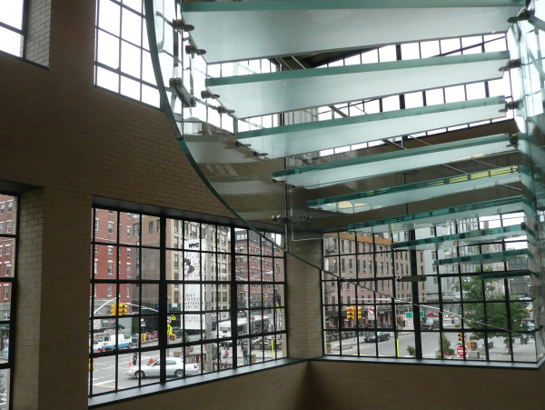
The stair, glass treads carefully frosted and etched with a gridweave pattern, carry an astounding continuous flow of New Yorkers and tourists up and down – 24 hours a day. In case you’re worried about the disabled access, there is a perfectly minimal circular glass elevator in the centre of the circular glass stair. Curved glass doors wrap around the elevator, and with the buttons mounted on a separate post, the entire elevator is an entirely seamless experience. The cleaner, needless to say, is a very busy person, polishing, sweeping, squeegeeing, dusting, and polishing again.

The 5th Ave store is not the only store in Manhattan however – there are stores in Chelsea, Greenwich Village, etc, where the same glass stair has been inserted into an existing heritage shell. In all cases, the original building edges have been restored to a clean, invisible, cut so that the transition is seamless. Architects for all the glass stairs, according to Maximus, is Bohlin Cywinski Jackson, who have taken out patents for their details. Cellophane bento box? A bit better than that I believe.


Leave a Reply