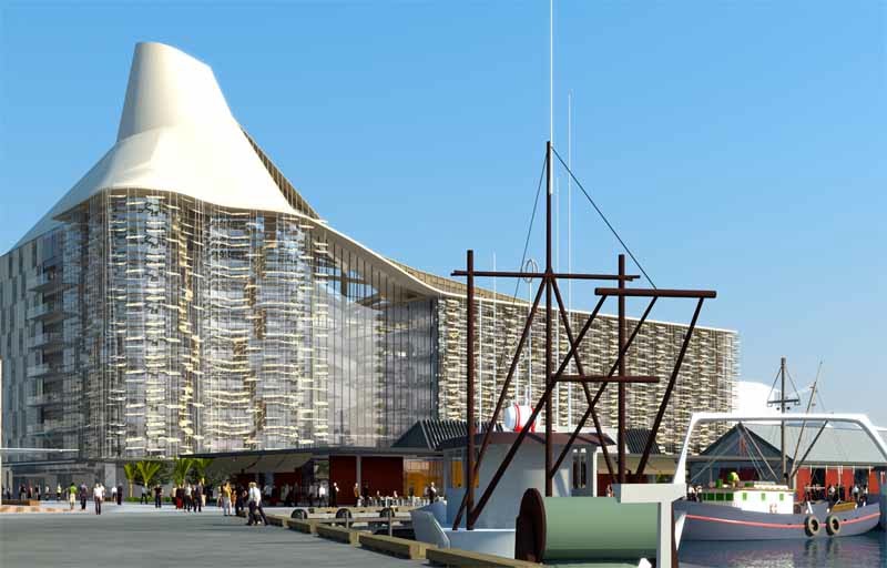
Just to show that we are not completely parochial here at the Arch Centre, from time to time it is necessary to cast our eyes south of the Strait and north of the Tararua Ranges and acknolwedge that building activity does take place in various regional centres… such as, say, Auckland – the City of Sales (no typo there, just the impression I get every time I visit downtown Queen Street)…
No – not a post addressing the super-amalgamated-councils and the super’men’ behind it all – just a little something that caught my eye recently – some artist’s impressions of a new ASB headquarters for the ex-Tank Farm (now more elegantly(?) renamed Wynyard Quarter).

While we have our own Waterfront development issues (not to mention Golden Mile, Basin Reserve, and Memorial Park issues), Auckland (and lets not mention their ongoing Queen’s Wharf/Rugby 2011 debacle), seem to be planning a vibrant multiple use precinct of commerce, residences, and office buildings, combined with (heaven forbid on waterfront land…) streets, and urban plazas, not to mention environmental remediation, and all the other things that good little urban designers like to talk about (that’s after a quick read of the Sea+City media release – so to be taken with the usual grains of salt in such circumstances). Some of the targets are rather less than bold (“40 per cent of new buildings in Wynyard Quarter to have the New Zealand Green Building Council five-star rating,” says Mr Dalzell”), and there are large swathes of, what look to this Wellingtonian as, rather uninviting green space – which even the inhabitants of the artist’s impression don’t seem to know what to do with…
But there is something about the flythroughs that strikes me as, well, nice… There is a surprisingly interesting scale, variety, and detailing of buildings which is completely at odds with something like this. I guess the reality could be a lot meaner than what we are presented with in the flythrough however…
Which brings me back to the ASB head office – as the first confirmed tenant for the site (I guess the current economic climate is making hard work for the developers in securing tenancies at the moment). While it is a really very ludicrous exercise to evaluate a building from a couple of artist’s sketches, without any understanding of how the building is organised and so forth, I am very intrigued by this little beast – mostly because of its ballsy ugliness in the face of contemporary fascination with the slick boxiness of what some have tried to dub as a “neo-modernism”.
If we are going to bandy about pointless aesthetic/stylistic labels to try and dignify contemporary work, then let me be the first to label this proposal as neo-New Brutalist. That seems appropriate when presented with the awkward massing and top-heavy and lop-sided ‘cone’, reminiscent of Sir Hugh Casson’s Elephant House at London Zoo,…
…which, in the ASB building at least, are accounted for thus:
Sustainability is a central theme in the wider Wynyard Quarter Precinct development, and ASB is also committed to ensuring the area’s long-term environmental, economic, social and cultural success,” Mr Pink says. “The distinctive cone at the top of the building is sustainability driven. But it’s also an echo of the fabric of Auckland in the volcanic cones that so dominate the Auckland landscape.
Yeah, ok.
…while the authors over at Eye on Auckland blog somehow associate it with the funnel of an ocean liner…
And while I doubt whether a neo-New Brutalism has any sort of a future, it does seem a relevant challenge to the status quo, as it was the first time around, as a reaction against the predominance of an architecture that draws its rationale from – in this case let’s call it the ‘sustainable’ age – and wraps it in a glibly kitsch modernist aesthetic (in that respect, the ASB building could, and perhaps should, be even more provocative in its calculated ugliness). This may not be the best avenue for reassessing the role of meaning in architectural expression, but at least the question can be raised legitimately, perhaps… it’s just that I am not sure that anyone else is as keen to shake off this creeping malaise…
Anyway, I guess I just wanted to say that I am as impressed as is perhaps possible from nothing other than artist’s views of this project, and am eager to find out more about it… for example, who the designers are… etc?


Leave a Reply