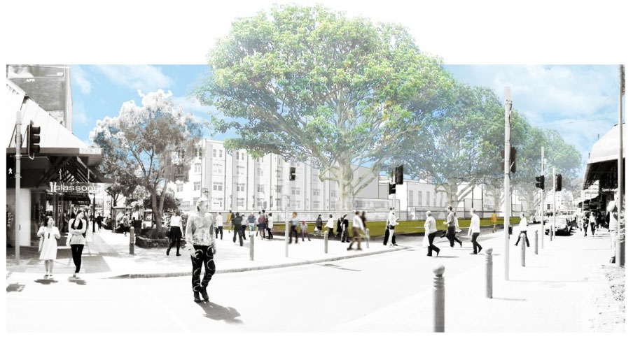
I haven’t been down to the container exhibition of WCC’s Wellington 2040 vision, but am looking forward to doing so soon. What I have seen is the recent post over on EyeoftheFish, which gives us a sneak preview of a small part of the type of outcome that might be expected to emerge from that vision: in this case, a new green space where the Oaks building is currently sited. As the Fish reports, that site has been the subject of many suggestions for ‘improvement,’ some of which are captured in this thread. A particularly intriguing one was the suggestion of a ‘Flatiron’/wedge-shaped building on Te Aro Park, and a park where Oaks currently is – a swap of building for open space and vice versa.

Anyway, WCC’s artist’s impression for this specific site (in accordance with the 2040 vision), has been published by the Fish, which I have plagiarised (above) for this post (click on the image to see it larger over on EotF). Although WCC might well be congratulated for a bold vision and a positive intervention in our urban fabric, at a detailed level, the featureless expanse of lawn probably leaves a lot to desire (and would present a heck of a maintenance issue, even worse that those that currently exist on the Te Aro Park part of the site). That aside, there are other, I think more interesting, issues here that seem always to be overlooked when discussion of what to do with Te Aro Park arises – in particular, issues of both urban and cultural heritage.

Te Aro Park is deeply unloved by most commentators and general public alike*. It doesn’t fit our idea of what a contemporary ‘Western’ urban space should look like – all tidy with sharply delineated edges and slick public furniture (i.e. the ‘Wraightian’ sense), or, on the other hand, in the softly moulded and more ‘naturalistic’ micro-Picturesque format (which is so out of fashion with designers, but still, I suspect, very popular with our public). Instead we have untidiness of detail (exacerbated by a poor maintenance regime and other factors), and an indeterminacy of function due to a design language that is quite ‘other’ to our expectations – those triangular seat/benches for example, or the use of pottery in various forms as one of the key materials at the site, or the shifting/weaving geometries perhaps, and so on…

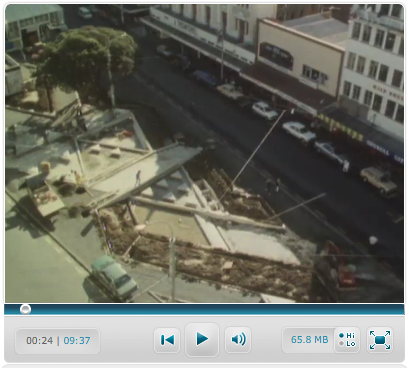
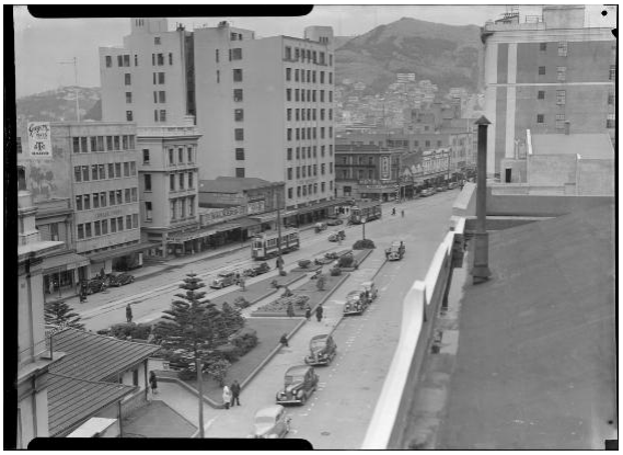
The park was of course, very contentious from the outset, and is much more famous (or infamous perhaps), for this reason than for its design. Shona Rapira-Davies became a much targeted figure during its construction, not only for her inability to manage the project according to her contracted obligations, but also for her somewhat abrasive responses to these criticisms. Considerable budget and time overruns for an indulgent project (such as this turned out to be), are never going to be popular with the rate-paying public, and even less so when the park is delivering something unexpectedly other on a site that was much admired in its previous form:

WCC had bold and enlightened plans when they commissioned Rapira-Davies to design and construct the park. The intention was to create an artwork at the scale of urban intervention – art that was not just a single object “plonked in space” (ala Sculpture Trust), but an integrated work of both art and urban fabric. They were excited at the prospect of creating the largest artwork in New Zealand.

Rapira-Davies’ proposal must also have been attractive insofar as it connected explicitly to the pre-European history of the site. her proposal addressed themes and issues of Maori culture and history – and from Rapira-Davies’ stance on Maori Feminism (the entwined nature of the Maori rights movement and the Feminist movement of the 1970s is an interesting area of study…).

The park itself sits on (or very near) the former pa that existed on the site. Rapira-Davies’ scheme was in fact a subversive move (although also an endorsed subversive move), to symbolically reinstate the former pa – “to force recognition of its shifting histories and cultural usages” (so writes art historian Jenny Harper). If the language and design moves are somewhat other, then this recognises the need to react against the existing built environment, and to replace it with ‘natural’ forms (e.g. the native trees that never flourished, flowing water pools that evoke a former stream, traces of plants impressed into the tiles before firing, etc), as well as traditional Maori cultural motifs, such as the interweaving geometries, the tukutuku inspired patterns of the glazing etc, the evidence of handwork deliberately left as traces in the tiles as an echo of the closeness of the hand to Maori craft, and so forth.

It is not supposed to be a ‘comfortable’ space for the contemporary New Zealander – it was not designed to be easily accessible.

And, of course, therein lies both the power of the space and its undoing. Further examples: you may have noticed the Maori names on the tiles of the ‘bridge’ between the waterfalls – these are the names of vanquished ancestors – now walked over daily as further insult to their mana. You may also be able to detect the figures depicted in the pool tiles’ coloured glazing – 3 depictions of a goddess/guardian figure as: a young girl, an adult, and an elderly woman (these were ‘painted’ by Kura te Waru Rewiri). The trees along the street edges are the warriors powering the canoe that the general shape of the site represents – the prow being the obvious element at the Taranaki Street end. These vertical elements are the ‘male’ presence of the site, with the ‘female’ element represented in the more dominant and elaborate horizontal plane. The park is extraordinarily  rich in symbolic readings such as these – on a level that is far beyond any contemporary project I can think of – too much for most of us to contemplate perhaps.

Check out the panorama of Te Aro Park supplied by Panoramic Earth

Despite all these words, I’m not advocating for the retention of the park. I am arguing that it has significant heritage value (in terms of Wellington’s cultural, social, and urban history), but that in itself, for me at least, doesn’t mean that it should be kept – although I am impressed that other more ardently ‘pro-heritage’ commentators can easily dismiss something of this nature. The issue of whether the park should be kept as heritage, in the face of its unpopularity (when heritage suggests inheritable value) is fraught, and I’m all in favour of a decent urban fabric and public environment. But it seems to me that the full debate is not being had, and that (to me at least), is rather problemmatic. This post, then, is my attempt to ‘table’ some broader material for such debate.

Whatever. It’s all too late of course – the park is due for a light upgrade next month (2040 vision notwithstanding). The triangular seating is a key target apparently. Oh well – what we didn’t even realise that we had, probably won’t be missed…

To be completely honest, this post actually began as a brief Video of the Week entry for your Friday entertainment needs, but it kind of got away on me. The video that I was going to feature is “Cat Among the Pigeons” – featured in 6 parts on the NZ on Screen. It is a great historical documentary that covers the construction period of the park – capturing well the work that Rapira-Davies put into it, and balancing her aggrieved point of view nicely with the attempts of the key WCC players to be as accommodating to her as possible, whilst still trying to achieve a positive outcome in the face of strident public opposition… It’s well worth the watch:

You’ll have to watch the doco to see where the title of this post comes from…


* I’m quite intrigued by how popular the park is (especially compared with the newish Courtenay  pocket park across Taranaki), on a good day – but that may be more representative of the lack of public open space along our golden mile than any evidence of a popular appreciation for its urban design qualities…
Comments

17 responses to “Making porridge pancakes: Te Aro Park”

  1. Really helpful post Michael – I had no ideas of half of that back history, and am intrigued by the Shona Rapira-Davies story – the trial of love and artistry that is now, as you say, unliked by Wellingtonians. Or is it?
    I think aspects of the space design come down to the layout -it having being designed more as a walkable work of art, than as a corporately designed, carefully planned out urban design landscape. Rapira-Davies wasn’t thinking of those things that now we know – the old Jan Gehl adage that people like to sit in the sun with their back against something, rather than here where the seats are triangular so everyone faces away from each other. I used to have lunch there regularly – but knowing that the patterns are not just artistic playfulness, but descended from ancestors found on the site – that makes it more deserving of respect. Its the complete opposite of everything else in town – which is precisely what makes it so interesting, so nice.

  2. I love how all the landscaping schemes always show 100 year old trees! I guess the artist’s impression is not a lie but it’s really annoying how we’ll never see the space as shown in our lifetime. I think that this is a real failing of many urban landscaping projects. The party who wants to sell the given project to the public dress it up for the sale. Then the projects goes ahead and people are disappointed. The developing party can always say “well, what did you think was going to happen? Trees take a long time to grow” (or whatever excuse they might offer). On the one hand it’s looking toward the long-term future but then on the other hand most people don’t care and want something immediate.

    I guess what I’m trying to say here is that whatever is proposed it would be good to see a scheme that addresses the passage of time. Show us the park as it will be in 5, 10 and 20 years time. While I’m a strong advocate of long-term thinking when it comes to urban development, I think that the visualisation of the short-term is much more important than the long-term simply because things never work out as intended in the long-term. Change is inevitable, unavoidable and good.

    cheers,
    -tomek

  3. Fascinating documentary. Once you get some understanding of the artwork you gain a whole new appreciation for it. I wonder if it could be incorporated in a new park design. Right now Te Aro park is an isolated island. But if the new park was extended onto Dixon St maybe people could be better involved with the art. Its a powerful piece, coming from a dark place that tells a story of local Maori history. Can’t think of what could be more fitting for that site.

  4. It would be interesting to investigate if the park could be somehow connected with that token pa exhibition on Taranaki St (ground floor of an apartment building).

  5. Maximus Avatar
    Maximus

    “token pa exhibition” aaah, Tomek, that is where you are wrong. You see: the whole area around there was once the site of the Te Aro Pa, the home of the local iwi living happily on the edge of the harbour until the pakeha came along and surrounded them with the city grid. For a few years the two cultures co-existed, until eventually the town planning byelaws made it illegal to build and live in simple huts, and so the people of Te Aro Pa were banished and the land got taken over by whitey. Or something like that. Point is: all this land is / was / still is maori ancestral land, and so it is all quiet sensitive.
    That token Pa exhib is the original bits of timber still in their gravel surroundings, and as the films showed, Rapira-Davies reburied the bones of one of the ancestors under the prow of the waka at the end of the park. So, yes, it is all part of the same thing already.

    PS – 100 year old trees? They’re there in the form of existing 80 year old pohutukawa on site already – round by the back of the Oaks. Doing quite well thanks. Not so sure about those wussy deciduous pictured in a row. Its just a placeholder of a design idea – even the original article comment “the featureless expanse of lawn probably leaves a lot to desire” is missing that this is just a preliminary ideas sketch, not a fully fledged project yet.

  6. “…even the original article comment “the featureless expanse of lawn probably leaves a lot to desire” is missing that this is just a preliminary ideas sketch, not a fully fledged project yet.”

    Yes, I completely get that, and because I recognise that it isn’t a proposal as such, is why I wasn’t more scathing of it in the post, and only touched on it lightly (and because I am only commenting from seeing a couple of images).

    But I do think that a ‘vision’ document needs to indicate something more – if only to stop future complaints of the council “promised this but delivered that” variety. Just think about how those advocates of green open space are going to support his vision based on images like that, and then feel shafted by the smallest amount of built presence on the site. I think it better to be slightly more honest upfront, in order to circumvent that unhelpful drama later on. It is a tough thing for WCC to balance though, because any visuals shown will be read by most as ‘proposals’, and if they don’t show any visuals, well, there isn’t much of a ‘vision’…

  7. It doesn’t show much vision at all if you ask me.

    If we are going to erase a site like Te Aro Park, better be something a damn sight more meaningful than a piece of lawn.

  8. The WGTN 2040 document says the following about the Triangular Spaces, of which this Te Aro Park idea is one. It goes like this:
    “Triangular spaces in urban environments are highly prized because they represent a junction of more than two streets, offering wider, more interesting views and a vantage point from which to understand where you are in the city. They make cities easier to navigate and therefore more walkable.

    Wellington’s central city has an abundance of triangular spaces which were created where the original city street grid met the old shoreline. They make a significant contribution to the central city’s compact, pedestrian friendly form and tell an important story about the way Wellington has changed over time.

    They are also reasonably rare and distinctive.

    This idea involves redesigning the following five key triangular spaces to make the most of their special features and strategic locations. These redevelopments will improve connections to the waterfront and other civic spaces, create more quality cultural and performance spaces, and revitalise parts of the city.

    1. Te Aro Park: could be better integrated into Cuba Mall and offer a performance space.
    2. Michael Fowler Centre Car Park: could be a new civic space which revitalises the entry to the Michael Fowler Centre and better connects the city to the waterfront.
    3. The intersection of Victoria and Wakefield Streets: could better connect two significant streets to Civic Square, the Central Library and Council offices.
    4. The intersection of Lambton Quay and Hunter Street: could better emphasise the important heritage buildings here and improve the intersection of three important streets.
    5. Post Office Square: could offer a more attractive open space with good links to the waterfront.

  9. Maximus: I know a little about the history of the site. The reason I called it a “token” site is because of how insignificant and forgettable the “exhibition” is with respect to the significance of the site. You’ll hardly ever see anyone go in there, definitely not tourists and if you ask locals if they know what it is you’ll find that probably half the people will have no idea.

    That’s why I was suggesting some kind of a stronger link between it and the park.

    cheers,
    -tomek

  10. Guy – I’m fully onboard with the philosophy of the whole thing (and am quite inspired by the recognition of the triangular parks for example), all I’m saying is that the vision doesn’t match the ‘vision’, and, quite perversely, nor can it…

    Or something like that.

  11. jacqui Avatar
    jacqui

    RE; people’s opinion of Te Aro Park;
    Do people like or dislike the park, and why? There have been supportive comments in this blog, but on others, such as The Eye of the Fish, it’s described as ‘uncool’ and ‘under-used’.
    I’m interested in people’s honest opinions.

  12. That’s the million dollar question I guess. I can only relate anecdotal evidence to the effect that anyone I’ve heard comment on it has always been negative. I’d quite like to be proved wrong though…

  13. Jacqui,
    Like or Dislike? I’m not sure I have an answer to either of those questions – to me, its more like – is it Usable, or Unusable? I used to work very near there, and would on occasions go there to have lunch. It is not a friendly place to have lunch – traffic on either side of you, seats facing in the wrong directions – its a good design for sad lonely losers, but not such a good mix for happy friendly groups. That’s my honest opinion.

  14. Oi spam! Go away and stay away – no one is interested in you. Intelligent comments about design and architecture, or else pack your bag!

  15. Stephen Avatar
    Stephen

    Food for thought on design.

    1. A topical issue at present is jay walkers and the picture shows people crossing to the park across busy roads. Should pedestrian barriers be installed on footpaths limiting points where people can cross the road – surely the design should be based around these entry points?

    2. While the pic of 100 year old trees looks nice – a MAJOR issue with the old park was pigeons that caused the whole area opposite the State Opera house to be white. Do we want to encourage birds?

    3. When you look at Midlands park usage or even at old pictures say of the former park in Wakefield St outside the WCC buildings or old pics of Pigeon Park- it shows people sitting on raised edges (not seats) with grass behind. That’s why I think the new design should incorporate this feature and why the Courtney Park is not as popular (apart from sun access).

    4. Scum. When you look at all the issues they used to have with louts in Manners St and the vagrants in Glover Park – the design should be open to discourage anti social behaviour or people sleeping over. – Say no cover and water sprinklers at night.

    5. Ensure future design has family friendly features such as toilets. The sides of the building could contain historical information with pictures of the area over time – say 20 year blocks. – the current Pa references relate to only a small slice of history there.

    6. Ditch the Shona Rapira-Davies design – it only reminds us older ratepayers of how we were ripped off with a blown out budget.

  16. Surely that can’t have been spam, just an enlightened commentor who values marvellous writing and isn’t afraid to say so..!

  17. […] The park was designed in the shape of a canoe by ceramics artist Shona Rapira Davies in 1992. As the park was once occupied by the early settlers Te Aro Pa, Rapira Davies choose to shape the park like a waka with its prow at the point of the park close to the intersection.[1] […]

Leave a Reply

Your email address will not be published. Required fields are marked *