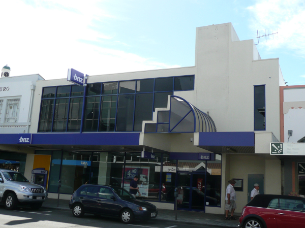
Following on from my previous comments on the great work of the Art Deco Trust in Napier, its also worth looking at the efforts, some good, some bad, of architects and others who have tried to replicate the art deco look in that city. There were 3 good heritage buildings knocked down, with two of them facing each other on the major street corner of Hastings St and Emerson St. The ANZ was one: it was replaced by a blueish mirror-glass cube with few redeeming efforts at all, except for its propensity to reflect back the facade of the BNZ opposite. Really, only one good thing came out of the demolition of the ANZ (and the National Bank building diagonally opposite): they provided the impetus for the creation of the Art Deco Trust.

What happened since then was truely bizarre: the BNZ moved out of its fine headquarters, to construct a new headquarters a few doors down, with the most hideously bad interpretation of Art Deco ever seen: we’ll not name or shame the architects: it was the 80s after all…The ASB, another bank (Auckland interlopers), then moved into the former BNZ building and restored it beautifully, much to the BNZ’s chagrin ever since, I imagine. The ASB (ie former BNZ) was designed by _____? and is one of New Zealand’s foremost examples of incorporation of Maori decoration on both the external and internal surfaces, and is now one of the jewels in Napier’s crown of Art Deco city title.
Meanwhile, the National Bank demolished on the other side of the road around the same time, proceeded to rebuild on the same site, firstly with a monstrosity akin to a Kentucky Fried Chicken edifice: later heavily modified to look a little less offensive. So: three banks still cluster the 3 sides of the corner: the final jigsaw piece is just being fitted, with the arrival of the TSB Bank (Taranaki interlopers) on the last remaining corner (in the Criterion Hotel building), Napier should be all banked out for the remaining future. Judging by the uncared for appearance of the ANZ and new BNZ buildings, the move to 80s ‘modern’ buildings just does not pay, at least not in a land where true Deco reigns supreme.

Following on from the BNZ debacle, just down the street was the creation of this hideous mock deco skin thing courtesy of ‘developers’ the Hoggs, again in the 1980s. The city District Plan rules at the time permitted buildings up to 8 stories tall, and this development started off with an ominous hiss and a roar, demolishing a couple of small buildings of quiet deco value, and replacing it with one of the poorer quality developments in the city, replete with stick-on ziggurat(ish) deco-ration. Luckily, money and inclination to complete the full 8 stories ran out after only a couple of floors.

The last of the demolish and rebuilds got far more press at the time, and even a protest march through the city if I remember correctly. The battle for the UFS pharmacy was a tipping point for the city – noted local architect Paris Magdalinos was quite bullish about the demolition of a 2 storey Spanish Mission minor beauty, and its replacement with a single storey, but far more 3 dimensional structure. Much debate ensued, with supporters in both camps: while there was dismay that a perfectly good deco building was being demolished to make way for a mock deco building of smaller size, there was also joy in the recognition that new buildings could indeed be created with a more modern deco flavour. In the end, the Art Deco Trust and the UFS kissed and made up: the new UFS was awarded by both the local branch of the NZIA and the Art Deco Trust as well.
g-m


Leave a Reply