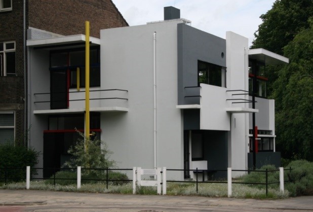
This small 190m2 two level house (Utercht, 1924) located at the end of a row housing scheme in Utrecht is widely regarded as a masterpiece of early modernist architecture. As an exemplar of poineering modernism, it attained recognition as a UNESCO World Heritage Site. It was designed by the Dutch architect Gerrit Rietveld for Truus Schroder-Schrader and her three children in 1923. Rietveld latter lived and practiced from the small architectural studio on the ground floor. Rietveld was a member of De Stijl,’The Style,’ a Dutch aesthetic movement of which people such as Mondrian and Van Doesburg were key members.
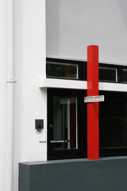
The aesthetics of De Stijl, also referred to as ‘neoplasticism’, signified a radical departure from mainstream artistic practice in Europe in the twenties. Its members invented a new abstract geometric composition based largely on abstract structures of rectilinear planes, straight lines, squares, rectangles, combined with a strong asymmetricality. The planes and lines were limited to the primary colours: red, yellow, and blue, and the three primary values: black, white and grey. The members avoided symmetry and attained aesthetic balance by the use of opposition. This element of the movement embodies the second meaning of stijl: ‘a post, jamb or support.’ This is best exemplified by the construction of crossing joints, most commonly seen in the carpentry. Vertical and horizontal lines are positioned in layers or planes that do not intersect, thereby allowing each element to exist independently and unobstructed by other elements.
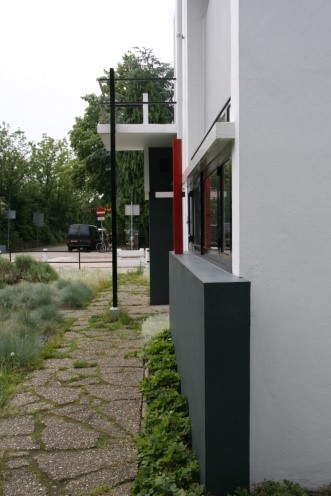
Architecture plans and spatial organisation broke away from traditional configurations based on conventional thought and centred on development of new modes of daily living. The architecture was one of deliberate liberation of space, freeing inhabitants from past conventions, optimistically forging new spaces for imagined new futures and living/work arangements following the strictures of World War I. This attention to the daily utilisation of space and the generation of built form pared down to strict functional use, gave rise to the modernist notion of functionalism where the idiom ‘form follows function’ remained in vogue for many sucessive generations of modernists.
The building is designed in accordance with key tenents of De Stijl [1]:
- Eliminate all concepts of traditional form, in this sense the new style is ‘formless’, liberated from existing building types not reproducing them, completely new.
- Elemental, meaning the architecture develops from a new attitude or attention to elements of function, mass, surface, time, space, light, colour and materials.
- Economic in that the elements are used effectively and thriftily. The elements are expressed individually through contrasting colour and shape, often running past in space with adjacent members. The making of the object is celebrated as a truth to construction.
- Functional in that the building develops primarily out of use.
- Elements exist on the basis of their interrelationship with others and are as expressed as such
- Everything is strictly determined by contrast e.g. the openness of windows is defined by opposition to the closure of adjoining wall surfaces
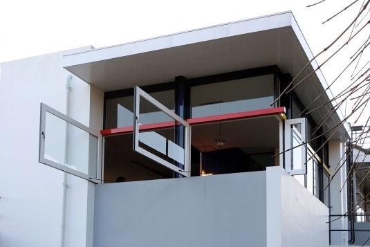
- The new architecture has opened the walls and so done away with the traditional separation of inside and outside. Inside and outside now pass over into one another.
- The new architecture is open and divided according to various functional demands using movable dividing surfaces.
- The new architecture takes account not only of space but also the magnitude of time.
- The new architecture is anti-cubic, that is it doesn’t attempt to fit all the functional space cells together into a closed cube but projects functional space cells as well is overhanging balconies etc, centrifugal from the centre of the cube outwards. Corners are often dissolved as the case of abutting corner windows.
- The new architecture achieves a more or less floating aspect, cantilevering elements past each other as if in opposition to gravity.
- The new architecture has eliminated monotonous repetition and also symmetry. There is no repetition in time, no streetfront, no standardisation. The new architecture has rendered front back right top left and bottom, factors of equal value.
- In contrast to traditional frontalism which has its origin in rigid, static way of life, the new architecture offers the plastic richness of and all sided development in space and time.
- The new abstract architecture has done away with traditional painting of walls as a separate and imaginary expression of representation. The new architecture permits colour organically as a direct means of expressing its relationship with space and time.
- The new architecture is anti-decorative. Colour is not a decorative part of architecture but its organic medium of expression.
- The new architecture permits no images such as paintings or sculptures as separate elements. Its purpose of creating a harmonious whole with all essential means is evident from the outset. Every architectural element contributes to the attainment on a practical and logical basis of a maximum of plastic expression without any disregard of the practical means.
For me, this building is the closest in twentieth-century architecture to expressing an integration of creative intent and realised form. It symbolises the rise of a new intellectual base for architecture, where all aspects of the design have a thorough and readily understood intellectual rationale, a rigour of thought and enquiry unlike the previous traditions dogged by limited stylistic imitation. The design integrates the search for new ways of living and built form. It was and still today represents a radical mindset and way of living for the occupants. Gerrit Rietveld was a furniture maker before becoming an architect. His architecture and particularly this house can be considered as a piece of furniture that is capable of being transformed into different internal spatial arrangements and external environmental conditions. He explores an incredible array of joinery design with numerous pieces of built in furniture that form the flexible spaces in the house. It is a three-dimensional realisation of a Mondrian painting. The building has a high degree of flexibility of the internal environment with numerous sliding and folding walls capable of dividing an essentially open plan space into smaller cubicles for visual and noise privacy e.g. bedrooms.
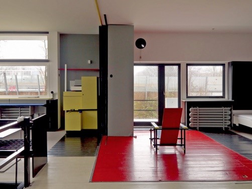
A shortfall in the design for me, if I can criticise such a masterpiece, is the way in which the roof is treated. Whilst there is a provision for daylight from the roof into the main central stair and built-in ladders on external walls, rooftop living doesn’t seem to rate highly in its design. This is unlike other early pioneering modernist houses where the roof space rather than simply enclosing interior space is used to thrust open into the space beyond the house in the form of roof terraces and outdoor roof living. Possibly the Dutch climate made this untenable.
Peter Parkes
The “My favourite modernist building …” series is in support of Gordon Wilson Flats which is facing threat of demolition
Photographs by Peter Parkes, 2012
[1] Ulrich Conrads: Programs and Manifestoes on 20th century architecture, ‘1924 Theo van Doesburg: Towards a plastic architecture’, Lund Humphries, 1970

Leave a Reply