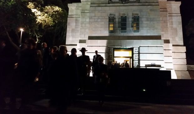
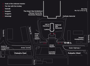
In April this year, the National War Memorial Park | Pukeahu was opened. It was formally blessed on Wednesday 25th March, following which the site was host to numerous public events. The park, formed above an undergrounded Buckle St (now Arras tunnel), was speedily built to meet the centenary of ANZAC Day. So what kind of public space is it? How importance is it as a national public space? Is this a design which will influence our future public spaces to come?
Here’s Tommy Honey’s view recorded on Radio NZ 9 to noon last week: http://www.radionz.co.nz/national/programmes/ninetonoon/audio/201753847/urbanist-tommy-honey
Featuring: Bruno Marques, Sally Ogle and Christine McCarthy
Sally, any thoughts on the memorial park?
Having only been to the park before it had opened – prior to Anzac day – I’ve only seen the park in its pristine unused state.
It is a very slick piece of urban design, with refined but hardy materials and detailing. As the trees grow up it will only improve the park – visually screening it from the adjacent roads, and perhaps (hopefully) acting as a wind break. Surprisingly, and perhaps most importantly, being in this park doesn’t feel as if you are on top of a motorway. (Disclaimer, it was a Sunday afternoon when I was there, so not peak traffic time). Given the park’s proximity to so many central city apartments, to Massey University, and to Wellington High School, it is sure to be well used.
Standing on the steps overlooking the fountain, there has been a strong axis set up between the Old Museum, the Carillon and the new Australian memorial – and it is a shame that this axis visually terminates at the Century City Hotel, rather than continuing to the waterfront / Te Papa – as was intended in 1932 when the Carillon was designed and built.
The only area of this park that feels awkward is to the eastern end, where the relocated Home of Compassion Creche building sits, fenced off in an island of grasses, waiting for a road that is (fingers crossed) not to be built.
Bruno – your thoughts?
The Pukeahu National War Memorial was built to commemorate the 300,000 New Zealanders who have served their country and the 30,000 who have died during the First World War. The design of the open space is minimalistic with very clear lines throughout. It tries to evoke a strong feeling of respect and memories from the past but that somehow comes across in a very subtle manner. If you were not aware of the name, you would probably miss the context of it. The placed objects and sculptures attempt to establish a certain cultural relationship with other countries who share a common past with New Zealand.
A strong criticism to the design agenda of the War Memorial park comes with the interruption of the horizontal plane by the network of roads that cut off the space. I believe this disturbs the user in exploring the space in a smoother and unison way as well as breaks the continuity of the design, which should read as one. Somehow vehicles dominate what should be a place of memory, introspection and above all a pedestrian friendly environment.
Another point of disturbance is the placement of objects and sculptures that somehow don’t seem in harmony with the overall space but instead gives the feeling that those objects have been placed randomly. This impression contributes to the overall idea of unproportioned spaces and disparity between vertical and horizontal scales.
At the same time, the plant schedule is equally poor bringing underdeveloped and immature species that reiterate the idea of scale-disparity and contributes to a myriad of feelings around discomfort, exposure and insecurity.
and Christine?
It’s probably important that I declare upfront that the Architectural Centre was a member of the Memorial Park Community Forum, described in the National War Memorial Park (Pukeahu) Empowering Act 2012 as being: “held for the purpose of providing him or her [the Minister for Arts, Culture and Heritage] with information or advice in relation to the Park, including in relation to its design.” Of course in actuality, given the pace of construction, the on-the-fly decision-making determined by the tight project schedule, and the predetermination of the previous design competition entry, there was little scope for input into the design, and the forum – as enjoyable as it was – worked primarily as an effective community information mechanism.
It’s from this position that I’m aware that it must be tough to design an unfinished park, as that’s what the National War Memorial Park is set to be – at least for the next wee while, waiting as it is for the installation of a series of international memorials to mark New Zealand’s military relationships with other countries. Not only that but ironically, given the effort to tunnel SH1, the park is dominated by its auxiliary functions as thoroughfare causing a bleak monotony, rather than richness, to predominate. Perhaps this is due to the primary axis being oblique to anything interesting, as clarity of roadway, grey paving and even more grey paving, directs daily commuters through the space.

Unlike Canberra’s vast avenue of memorials leading up to the Australian war memorial museum, or America’s expansive war memorial lawns which enable large landscape gestures to be spatially unhampered, the New Zealand National War Memorial Park is constrained by a relatively small site, which is counter to the expectations of Gummer and Ford’s 1930s Dominion museum (1936) and Carillon (1932) scheme, with its intended and strong axial avenue down to Wellington’s harbour.
While the series of openings and ANZAC Day events were naturally successful, I suspect that this was largely because of the crowds of people providing life and movement. This is not to say that there are no gems within the park – Ruapehu, for example, is fantastic – but that the overwhelming result appears to be a somewhat bitsy and ordinary experience. I wonder if this is because of the inevitable clash with the dominance of the carillon and the sort of space this 1930s structure anticipates, still hopeful that Gummer and Ford will finish things off with a grand Beaux Arts flourish – or perhaps the design clings too longingly to a competition entry designed for what was effectively a very different site.


Leave a Reply