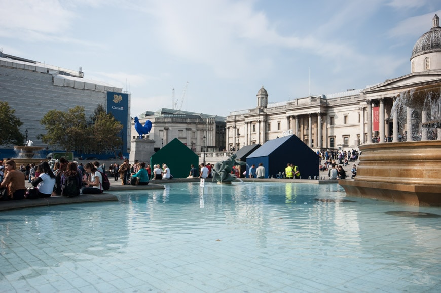
Mid September (18-22 September 2014 to be exact) saw four small gabled forms inhabiting the uncompromisingly urban space of Trafalgar Square in London. The concise timber structures were a London Design Festival installation: “A Place Called Home,” which reputedly aimed to address the question: “What makes the difference between a “house” and a “home”?” Artists and designers (Jasper Morrison, Patternity, Raw Edges Design Studio, and Studioilse) were each commissioned to elaborate on these bare enclosures to tease out this principal issue of domesticity.
Jasper Morrison‘s “House for a pigeon fancier” produced a sparse interior as a retro-modernist bird hide. His premise reflected the pigeon-dominant Trafagalar Square site; the interior subordinating itself to the comparatively decorative exterior; the spontaneity, colour, and life of the public space contained by the strategically placed windows and exterior view. The puritanical and vacant interior (the hard bed sans mattress, the restricted material and colour palatte), also contrasted with the elegant but insistent pursuit of the pigeon through images, and accommodation (roosting boxes and perches on the roof complete with model pigeons), and perhaps also the large, dark expanse of matt black, vulnerable to an array of pigeon droppings as a decorative force – the inverse of Mark Wigley’s identification of the white wall as an operation of surveillance.
Rather than the paranoia of a traditional hide (which comprehensive hides itself) the modesty of this house for a pigeon fancier, forces the viewer to look through, rather than at, the interior, presenting the house as persistently outward-looking, and the exterior as fascinated view.
The house by Patternity reverses the pigeon-fancier’s outward projections into an introverted microcosm. While this house is equally uninterested in showcasing habitation, its object of view is an abstract pattern understood by looking inward, and being seen outward. The house is a giant kaleidoscope, its skin a celebration of geometric fundamentals (circles, lines, triangles, squares), and the play of pattern. In this way the structure is both stubbornly object-like and a well of infinite space.
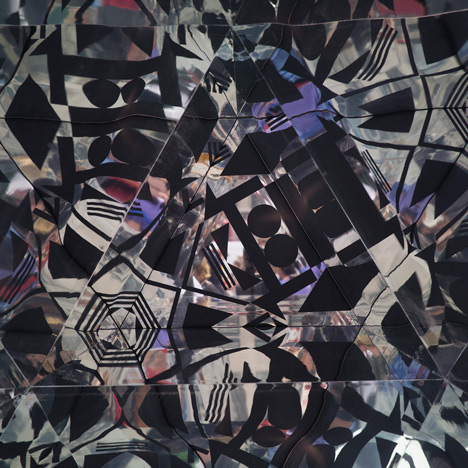
The inner space repels occupation through the nonsensical, disruptions, which obliterate any capacity to imagine and comprehend three dimensional space. The kaleidoscope’s rotational movement (also a pattern), incorporates rhythmical change and hypnotic engagement as the severity of pattern dazzles. The act of rotation is doubly complicit in image-making, as it drives pattern production and converts rotational energy into an act of surveillance, sending an image of the viewer off to a distance website. This larger scaling of space, from the relative intimacies of Trafalgar Square to the expanse of the internet, reflects, according to the designers, “home on a macro scale, … home being Earth which we all share” and an exploration of “the differing perceptions we have of home and the relationship between its inner four walls and the outer four corners of the world.”
Ilse Crawford’s Studioilse also embellished a house with electronic interference. Within the house shrouded in blue, and capped with a neon “HOME?,” can be seen projections lining the interior walls. A live Twitter feed brings an external conversation inside. Rather than using conventional architectural strategies to construct domestic space, the ephermal visual, acoustic and olfactorial lingering of moving images, changing words, sounds and smells reframe the building shell as a projector and amplifier of domestic traces, contrasting the painted consistency of the groundplane which asks “WHAT DOES HOME MEAN TO YOU?”; the question to which the images, sounds, smells and written texts respond. Rather than the sensual, and experiential, the question directly locates the home within the realm of abstract and decontextualised content.
Perhaps this is a commentary on living in our apparently digital world, ever connected, and ever fixated on screens of images, emails, and twitterings. Certainly it is old news that domestic space has been invaded by what once were workplace computers. Connectivity effectively infects domesticity with office technologies and behaviours. When Clockwork Orange was filmed this kind of image and word bombardment was interrogation, invasion, and mind-altering (and not in a good way). Today this is home?
Perhaps the most interesting house was Raw Edges‘. It certainly was the installation most actively engaged with physical occupation. The result of this was a mechanical play which assertively manipulated, conflated and confused the physicality and temporality of space.
“This project is about the fact that if you’re in one place at one given time, you can’t be in another,” Raw Edges cofounder Yael Mer told Dezeen. “When you’re in the shower, you obviously can’t be in the bedroom or the living room.”
The idea echoes the architectural dilemma played out in the NZ 1950s “part houses,” which inhabited Rotorua’s pumicelands, and likewise depended on temporal, rather than spatial, occupation of function. The historical context of part houses is recorded in Pictorial Parade No. 23 – Pumicelands, and in “Partial architectures” Fabrications (2003). In the pumicelands the bathroom and laundry each shared the same space, but at different times. The dining room and kitchen were similarly co-located. While the part houses used alterations to built-in furniture to effect temporally-constrained functions, the Raw Edges Trafalgar Square project, used shifting internal partitions on rails to expand and collapse space and so function; the shared wall between kitchen and bathroom, enabling the sink to be used by both rooms.
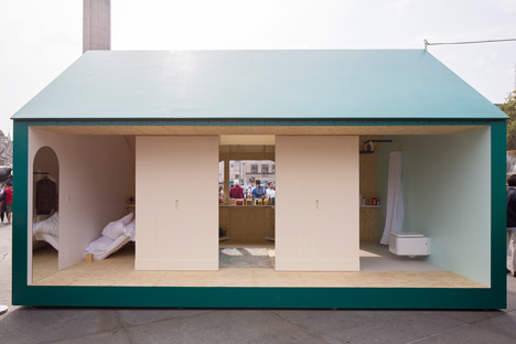
Apparently functional, these slippets of space, produce mostly spatially interesting and awkward interiors. The absence of one lateral elevation creates the inside as a stage-like set, but also removes the potential for a more sophisticated floor plan.
I’m not convinced that all of these propositions present compelling ideas of domesticity, nor do they all address in a productive fashion the question posed: “What makes the difference between a “house” and a “home”?” But they do explore issues to do with the construction and operation of domestic views – both introverted and outward-looking, and as well as those spatially and temporally framed. This is not to restrict ideas of home-living, but perhaps is a natural reaction to the plonking of a suburban domestic form on such an utterly urban site; a struggle of decontextualisation. Mary Douglas’ definition of dirt as “matter of out place” might be co-opted as a definition equally appropriate in this instance to the art and design of the London Design Festival’s “A Place to Call Home.” Saying this is really to wonder if some of the proposals might have been more productive if they have begun by interacting with the spatial awkardnesses of this matter out of place – the immediate material and form of this civicly difficult conjunction – rather than evading the pecularities of site by too soon a recourse to the big wide world of the internet.



Leave a Reply