A casual comment about architect costumes at the last Arch Centre committee meeting made me wonder what the most fashionable fashion victim of all time: Barbie – might be able to offer to the subject of architects and architecture.
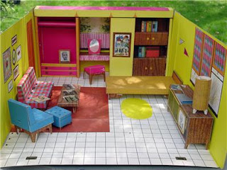
Barbie seems to have spent her life, since its beginning in 1958, continually moving house. I’m not sure what her first house was (the odds are a comforty shoe-box), but the 1962 “Barbie Cardboard Dreamhouse” must have been an early one.
This appears to all accounts to have been a modest first home. Even if the colour scheme doesn’t suggest it, the simplicity of cardboard, and its commitment to open planning – and even an open roof – indicate a Modernism to rival the Eames’ house of 13 yrs earlier. Barbie might be kitsch and she might be slow, but even Barbie pink and Kermit green couldn’t disguise her Modernist ambitions.
Other domestic arrangements were to include: the Barbie A-Frame Dreamhouse (1979), the Barbie Dream Cottage (1982), Barbie Victorian Dream House (c1990), and the Folding Pretty House (1997). While the A-Frame and Victoriana (symptomatic of their times) might indicate that Barbie’s fashion victimhoods included the architectural, I’d have to agree with Juliette Peers that some of these houses suggest a certain architectural avant gardism. Take the Dream House Cottage for example – with its transformative radicalism and its blatant disregard for thermal comfort …
But sadly the architectural radicalism allowable in the nursery, play room or rumpus room, was forsaken on Barbie’s 50th last year, when Mattel engaged “designer” Jonathan Adler to interior decorate a Malibu Dreamhouse for the skinny midget doll. 1:1 scale increased the kitsch and scariness factors severalfold. Loud and a certain grotesque was “in”.
But architecture has more room for Barbie than domestic abodes. As every five-year-old in our consumerist society knows, Barbie shops. … and now there are indeed Barbie shops, or rather the Barbie Store in Buenos Aires, Argentina (c2007) … and …
… this year’s Barbie Shelter by Slade Architecture in Shanghai.
There’s lots of pink-on-pink, and Apostolos Mitsios‘ and Nico Saieh’s articles have plenty more photographs of the intriguing “did-I-say-pink?” interior.
But what about my initial aim – to find the “Architect Barbie.” Apparently there was an attempt to ascertain which profession Barbie should reincarnate to next in 2002.
At one stage architect Barbie was winning. Some even noted that: “architects around the country, presumably older than barbie.com’s target audience of girls three to 11 years old, [were …] voting with a vengeance in both the kids and parents polls, as, apparently are the librarians. The police, which have badly trailed consistently for a week, presumably have other things to distract them from voting.”
One Irish architects’ forum begged their readers. “Architect Barbie needs your votes!” The ensuing conversation is fascinating from suggestions that Architect Barbie would wear a “blue print dress” to admissions that a Yahoo Group “Architect Barbie” had been created. The librarians, pipped at the post, suggested “Bilbao Barbie” as a goer.
A Barbie has even been made to celebrate the 45th anniversary of Hitchcock’s The Birds (1963). (One’s for sale on E-bay at the moment!) – but still no “Architect Barbie” appears to have eventuated. But I’m not sad because we have something much much better …
As usual Zaha wins again. Last year (2008) Olivia Lee, a graduate of London’s Central Saint Martins College of Art and Design came to the party with the Zaha: Empress of Architecture Doll. Scarier than The Birds any day!


Leave a Reply