

Submissions on the first (for what seems like a very long time) notified Resource Consent – the proposed Airways Tower – are due on Friday the 29th March. The application is to “construct, operate and maintain a new 32.5 metre high air traffic control tower at the Airport Retail Park on Tirangi Road,” on a site that is potentially contaminated. The Assessment of Environmental Effects states that the proposal achieves “good urban design principles” and responds to the surrounding environment, and has a “sense of movement” through ” a unique profile …”.
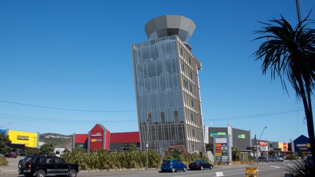
The tower design: “embodies a simple statement about Wellington’s well known wind prone environment. It does not shirk from addressing the wind, physically and metaphorically, and in doing so it makes a poetic response to the situation in which it sits.” So what do you think? How does (or should) urban design work in this seaside suburb? Should all of our buildings lean?
JOIN US on Friday 22 May 5.00pm for our online discussion on the proposed Airways Tower as part of our virtual launch of our givealittle site to fundraise for our involvement in the Basin Bridge High Court Appeal opposing NZTA.
Featuring: James Fenton, Peter Wood and Christine McCarthy
PETER, your thoughs?
The modestly skewed form for Wellington airport’s new airport control tower is described by the architects as leaning into the prevailing northerly at precisely 12 ½ degrees. Of course it doesn’t actually lean; the floors are level, the foundations are level, the control room is visibly level. The ‘lean’ is an anthropomorphic analogy that compares the control tower to those poor bastards bending into Lampton Quay on a bad day as though such miserable struggle is a proud Wellington symbol with which to greet airborne visitors. By the standards of architectural history it is minor moment but not one we should take for granted. Without its carefully calculated nod to Wellington’s breathy conditions the design would be nothing more than a miniature office block liberated from the 1980s and whose crowning glory is a vainglorious glass crown.
And JAMES?
Wellington Airport Control Tower – the Leaning Tower of Rongotai, aka LToR
The images provided show a generous skirt of native coastal planting and palisade security fencing. Next add big electric gates, generous parking and a paved forecourt; the prospect doesn’t offer much to encourage an improvement to the current shopping precinct. An opportunity to lead by design innovation amongst big box retail neighbours, who are not renowned for design innovation, does not appear to be tackled at the ground level. I can only hope the design development will encourage some further thinking beyond the current default condition, does it really need planting?
The tallest and most important building in the neighbourhood must aspire as a beacon within the isthmus. This is especially important in the knowledge that it will not be built out, unlike the poor suburban tower cousins, church spires, which are now rendered meaningless by surrounding suburban commercial centre developments, devouring their meaning and context. This suburban tower is an opportunity to be aspirational.
Concerning the lean, I have doubts about movement and dynamism as generative of architecture – these buildings tend to look like remnant costumes from a long past Futurist play. Generally such acts of caricature image making rely on pushing an idea to its extreme and then turn back the dial one click, Peter Beaven was a master at this. My suggestion for LToR would be to move the controllers cab to the front of the overhanging edge, rather than seated plumb with its footprint at ground floor –I do understand this move has implications, but at the moment the image is confusing.
This week Wellington City Council reinstated the Zephyrometer, now restored post lightning strike. It is now a fitting moment to contemplate the popular appeal of this public sculpture. The Phil Price needle may not be considered to be a great artwork however it has huge popular support. This meant no question was raised about whether it should be restored. Following the Christchurch earthquakes we have a heightened awareness that we, as a community, need to know what will be worth saving. This is a reasonable test to apply for any public project.
CHRISTINE, any thoughts you’d like to share?
My immediate reaction to the images of the proposed air traffic control tower was in the vein of “gimmick and effectively two-dimensional.” It seems to be another in the airport series of Wellywood sign, and international terminal “Rock”, which appear to be more about contrived controversy rather than what might be called “serious architecture.” In this regard the tower’s already been hugely successful, apparently making headlines internationally as well as locally. It is something that many people seem to connect to as an interesting idea of a building. It is also perhaps one of those rare instances where architects appear to be faining folk architecture; Robert Venturi and Denis Scott-Brown’s 1970s Learning from Las Vegas comes to mind. Here they identified a breed of commercial strip architecture in terms of “Big sign-little building” or “Building as sign,” famously giving as an example The Long Island Duckling.

Their thinking was radical at the time, challenging well-established norms of Modernism and the proclaiming “space,” and by extension three-dimensionality, as “Perhaps the most tyrannical element in our architecture” (p. 148). They talk, for example, of commercial strip architecture as communication and of the consequences of speed:

“This architecture of styles and signs is antispatial; it is an architecture of communication over space; communication dominates space as an element in the architecture and in the landscape. … The commercial persuasion of roadside eclecticism provokes bold impact in the vast and complex setting of a new landscape of big spaces, high speeds, and complex programs. Styles and signs make connections among many elements, far apart and seen fast” (p. 9).
Such a description also fits the Airways tower – but only almost, lacking as it does the vital context that multiple signs contribute to Las Vegas’ strip, but its folly is not that it is a two-dimensional sign, rather than a building, but that its signing is pretty useless. Despite its windward-facing prow, meeting the northerly head-on, it has popularly been misread as a local echo of the more famous leaning tower of Piza – as an image of somethng falling over.

While Venturi and Scott-Brown found something interesting and exciting in the popular culture of Las Vegas, they were more ambitious for architecture than encouraging a duplication of the signs lining the Strip. They wanted architects to rid the sign of its stated superficiality:
“If the commercial persuasions that flash on the strip are materialistic manipulations and vapid subcommuncation, which cleverly appeal to our deeper drives but send them only superficial messages, it does not follow that we architects who learn from their techniques must reproduce the content or the superficiality of their messages.” (p. 162)

I’m not convinced that the Airways Tower has managed to climb beyond its one-liner origins – but perhaps given its location adjacent to the asphalt ocean of a big box retail car park, such isolated and superficial Strip architecture can only improve the immediate surroundings. In fact perhaps buildings like the proposed Airways Tower should be encouraged to sprout within this light industrial neighbourhood; the speed limit increased, council signage regulations loosened, and neon lights set aflashing.

Leave a Reply